Not sure how to design a restaurant menu?
Not sure what tools to use to design your menu?
The menu of a restaurant is one of the most important aspects that owners must define for this type of business.
There are many things that you must consider to create the perfect menu. The design, prices, distribution, and organization of the dishes, and more.
If you have all this ready, it is time to design the menu of your restaurant.
In this article, I will tell you about:
- The best design apps you can use to create it
- About how you can define your menu items
- And a step-by-step tutorial on how to create one using one of the tools
- And more
I will also give you some basic free templates that you can use to design your restaurant menu once you have all the details well-defined.
Let's do it!
How to Make a Restaurant Menu?
Before you start designing your menu, you must define various aspects of your restaurant or at least, use your business plan and concept to gain inspiration to create the menu.
Remember that the menu of your restaurant must be in line with its image, so you must use elements of the concept of your restaurant, the interior design of your restaurant, and more to define a suitable menu design.
For example, if you have a very colorful restaurant, it is not a good idea to use a black-and-white menu design, without other colors or images.
Also, if it is a restaurant that serves dishes with beautiful platings, you cannot miss the opportunity to put photos on your menu.
Once you have defined these elements, you can start looking for the best way to execute the design.
4 Design Apps That You Can Use to Create Your Restaurant Menu
There are several apps that you can use to create the perfect menu for your restaurant.
Any graphic design or vector design app is sufficient to execute the design.
Still, you may not know which apps are best for you.
For this reason, I have created a list of the best options, with their advantages and disadvantages so that you know where to start.
Canva
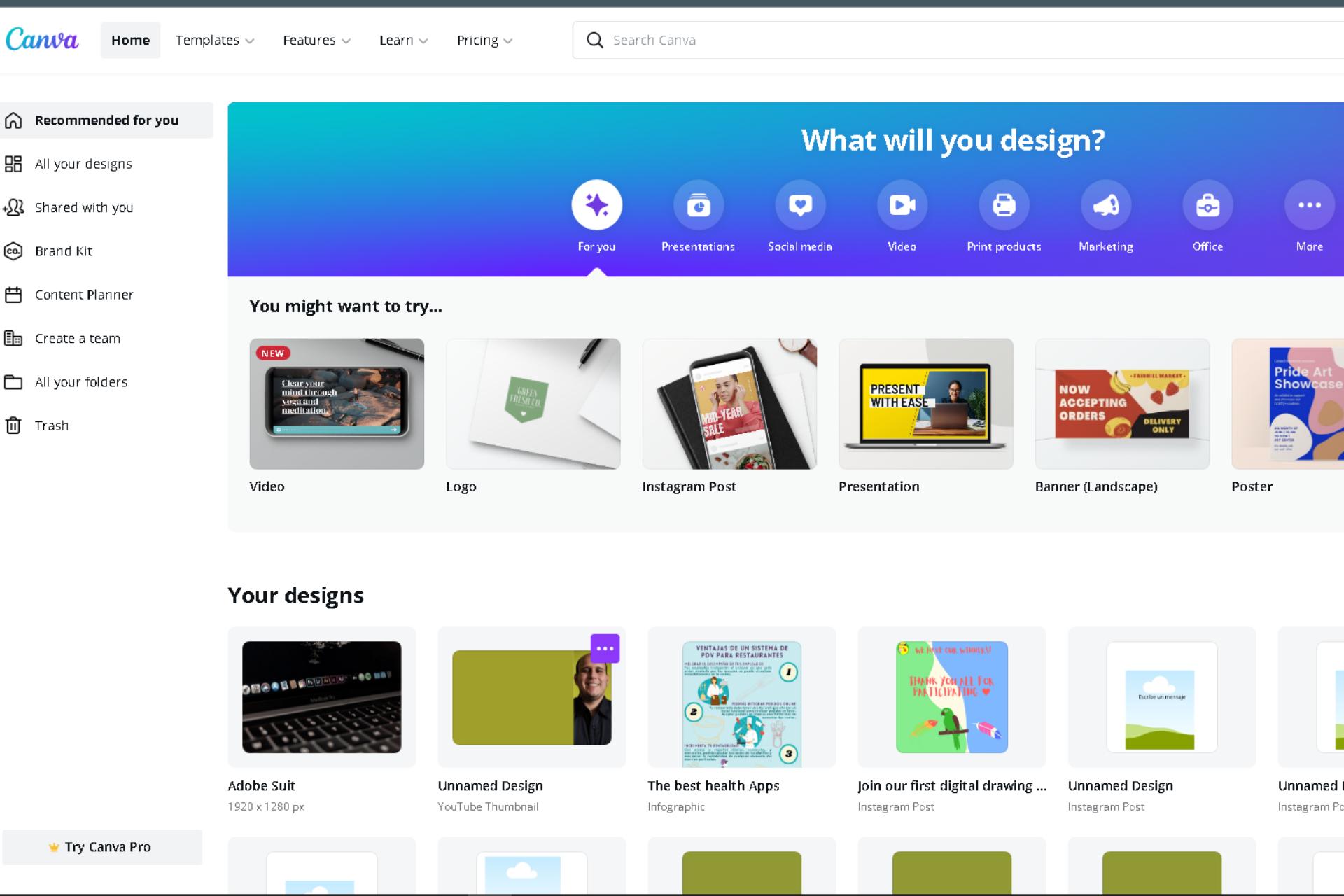
Canva is a photo editing program that is very easy to use.
It has several templates that you can use and edit to create your restaurant menu in a few minutes.
It also has a large number of illustrations, images, videos, and much more that you can use in your designs, which makes it even more versatile.
You can modify the sizes of the files you want to create so that each one is ready to print, and save your designs in JPG, PNG, PNG without background, MP4, GIF, and PDF.
This is an app that almost anyone can use, especially since it is supported by all mobile devices and also by the most current browsers.
Advantages and Disadvantages
Canva has many advantages — it is a lifesaving app for anyone who wants to use it and save money by avoiding paying a graphic designer.
It is a freemium app because it has a free version and a paid version that is also very cheap, especially considering the benefits it offers.
As a disadvantage, although it is very easy to use if you do not have some knowledge of graphic design, you may not be able to take full advantage of it — a little experience will not hurt.
It is also still a bit limited in its free version, and the paid option, although cheap, can represent an expense that you might not want to make.
Another downside is that a lot of people and businesses use this app to create designs, so the result may not always be 100% original.
Still, the cost of hiring a graphic designer to create your design can corner you, and turn Canva into a super viable option you can’t pass.
Inkscape
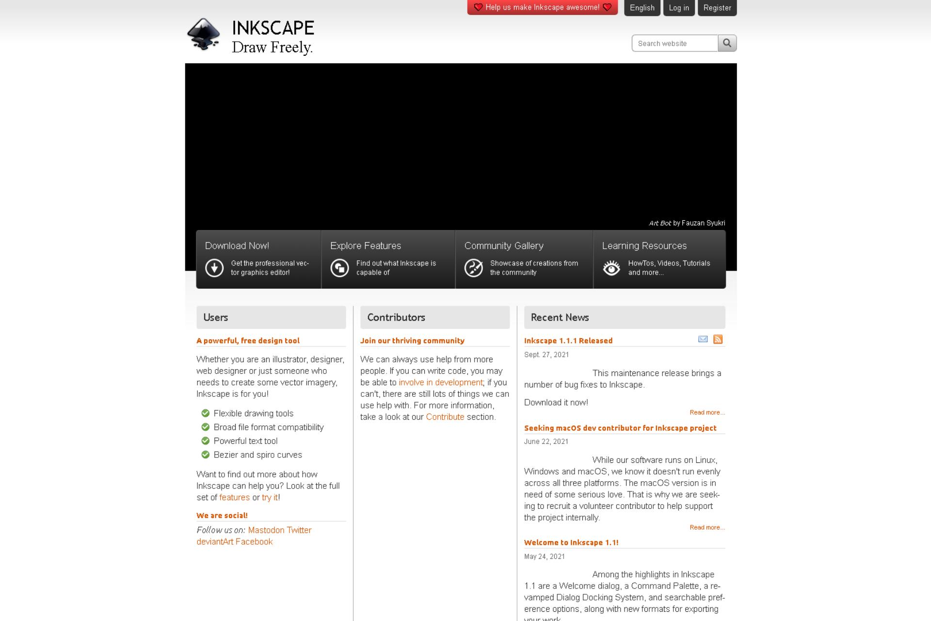
Inkscape is a free open-source vector design program — it is often used to exemplify what an open-source program should be.
It is because it is an amazing program with a lot of tools and functions. This makes it the perfect competition for similar Adobe programs, which are very expensive in comparison.
Inkscape is versatile and will allow you to create original vector designs, be they logos, menus, banners, and much more.
Advantages and Disadvantages
The main advantage of Inkscape is its price — $ 0. In addition, it has the same functions as similar vector design and animation programs, so it is a very complete tool.
You can find numerous resources to learn how to use the software for free on YouTube, which is full of tutorials and examples of what you can do with the app.
It also doesn't have very high requirements regarding processing power, so the barrier to entry is low.
Inkscape's downsides are few. For example, if you have experience with other apps, it may take a little longer to learn how to use them.
Although it is not difficult to use, you still have to adapt and if you do not have experience, it may take time for you to design something in it.
Even so, it is well worth the effort — once you have some experience with it, you will be able to create all kinds of illustrations, menus, banners, animations, and many more graphic elements for your restaurant.
Adobe Spark
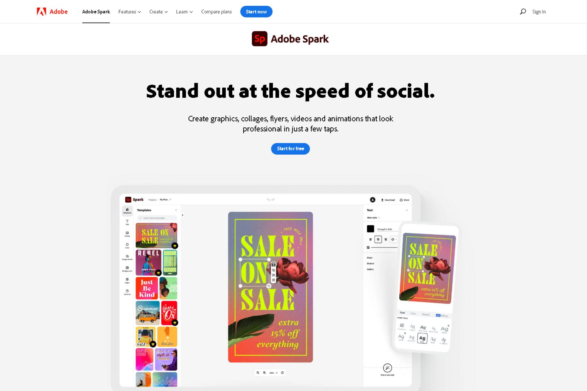
Adobe Spark is another amazing graphic design app for Android and iOS mobile devices. It is very similar to Canva, but it integrates better with most Adobe apps, so the workflow is much better.
This app also gives you access to templates, images, illustrations, fonts, and much more.
It is easy to use as it has simplified functions for mobile phones and tablets — although this doesn’t diminish its power or versatility.
It has many functions, such as converting videos to GIFS and vice versa, erasing the background of images, resizing images and videos, and much more.
Advantages and Disadvantages
Adobe Spark is great if you don't have much experience in graphic design thanks to its large number of templates, within which you will find digital menu templates.
Other than that, the benefits are very similar to Canva.
On the other hand, this app requires more design experience than Canva, and to get more out of it, it is a good idea to have the other Adobe apps and some experience using them.
And if you plan to use it in conjunction with other Adobe apps, the price goes up a bit more.
Adobe Illustrator
Adobe Illustrator is another program from the Adobe Creative Cloud, and it has been around for many years. It is a program used for vector illustration and design, similar to Inkscape.
Still, all Inkscape functions took inspiration from Adobe Illustrator functions, so it is arguably the original program concept — and without a doubt the most widely used across many industries.
This program has all the necessary and not-so-necessary functions that you can think of to create logos, illustrations, book covers, branding elements, and more graphic elements.
Advantages and Disadvantages
The main advantage of Illustrator is that it is the most widely used program, and it has a large number of learning resources, courses, and more. In addition, it is very easy to use for any project that requires illustrations, so it will be helpful for all kinds of designs.
Unlike Spark, this software can be used without other Adobe Creative Cloud programs.
It is also compatible with mobile devices, iOS, Windows, and macOS.
The main disadvantage of this software is its price of $20.99 per month, which is not that expensive.
However, you will need enough knowledge and experience to get the most out of the program — if not, you will be throwing money down the drain for pleasure!
Other Apps
Other apps you can use are:
- Corel DRAW: The quintessential graphic design software — and one of the most expensive on the market!
- InDesign: Perfect for simple designs and, as it is from Adobe, it has integrations for the rest of the Adobe Creative Cloud apps.
- Photoshop: You've surely heard of this one before!
- Desygner: A photo editing app for browsers. It is very similar to Canva.
- GIMP: This is the open-source software most similar to Photoshop. Although it is a bit difficult to use, it is free.
These apps are great for designing your restaurant menu.
However, I didn't want to mention them because some of them are expensive (I’m talking to you, CorelDRAW) and others have the same or very similar features as the ones I mentioned above.
Creating a Menu Step by Step
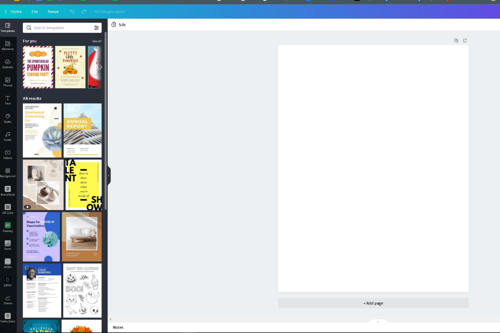
In this section, I will give you details about the creative process and the execution of the design.
To keep this example simple, I'll use Canva to create a simple layout — it's easy to use, so the steps to follow are perfect for those who don't have any design experience. Let's get started!
Define the Menu Information
Before starting, you must define all the elements that will make the menu. The main ones are:
- The number of dishes
- The name of the dishes
- The prices of each dish
- The distribution and organization of the dishes
I have defined these elements in a Google Docs document so that designing the menu is easier — just copy and paste.
After you have all of this defined, skip to the next step.
Define the Graphic Elements of the Menu
There are several graphic elements that you must define when creating the menu of your restaurant.
The most important are:
- Colors — study the psychology of color.
- The use of graphic elements such as illustrations and images — it is a good idea to use high-quality photographs of your dishes.
- Using branding elements, such as logos, slogans, and more — you can upload all of these elements to Canva!
- And the font you will use — you should use two to three legible fonts, but consistent with the other elements.
Each of these elements must be in line with the concept of your restaurant and your branding strategy.
This is what I have done:
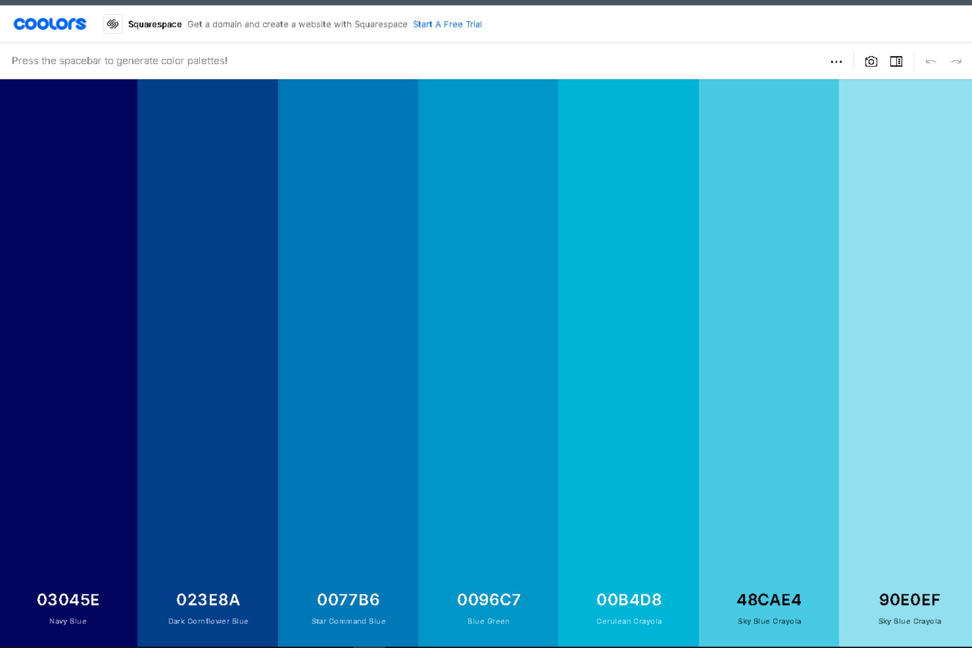
- I have used a tool called Coolors to generate the colors for my menu.
- I want to use simple graphic elements, and of course, I will use the Waiterio logo to identify my restaurant.
- I want to use images in my menu, but I don't have images of my dishes — especially since my restaurant is imaginary. So I decided to use free Canva images for a professional effect.
- Finally, my restaurant is fast food and my clients are casual, laid back, and young. That is why I will use a stylized and fresh font for my design.
I already have all my graphic elements defined — I hope you do too. To the next step!
Choose the Size and Distribution of the File
Size is another important aspect to consider.
The menus can be of different sizes, however, it is a good idea that you use a suitable size for your menu, so that everything fits.
The more items your menu has, the bigger it should be — it's not a good idea to have a 50-item menu on one page.
In addition, you should consider the costs of printing and the layout of your design.
For example, for letter-sized menus, you should use a size of 2550x3300 pixels, which is the size of a letter sheet at 300 DPI for standardized prints.
This will guarantee you achieve the best print quality.
Start Designing
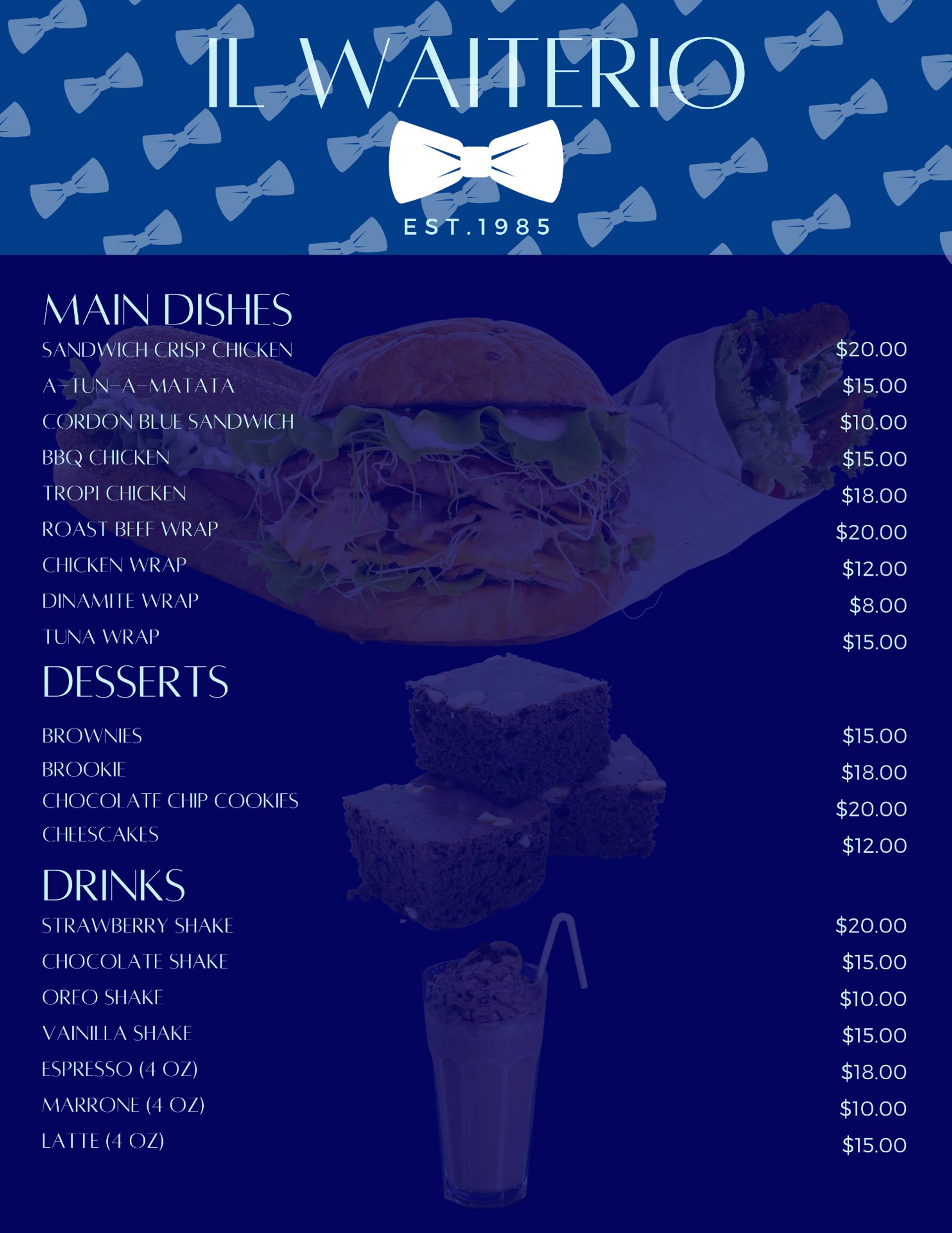
When you have defined all the previous elements, it is time to start creating the menu.
- Create a new document with the size you have chosen for your menu. I used a letter.
- You can speed up the design process by selecting one of the available templates. I picked a very simple one.
- Choose titles, letters for the dishes and descriptions, and all kinds of graphic elements.
- Add color, background images, and more. Always keep in mind the contrast of the letters — they must be legible.
- When your menu is ready, simply download it in PDF format, and it is ready to print.
And that’s it. Creating the layout for this example took about 20 minutes! Check it out here:
Restaurant Menu and Templates
If you made it this far, you're in luck, because now I'll share with you three simple templates that I created with Canva that you can use to guide you when designing your restaurant menu.
Also, I will be sharing the layout that I have used for each template.
It should be noted that I have created these templates based on menu engineering and studies done on the way people scan a restaurant's menu.
I hope they are useful for you!
Basic One-Page Menu Template
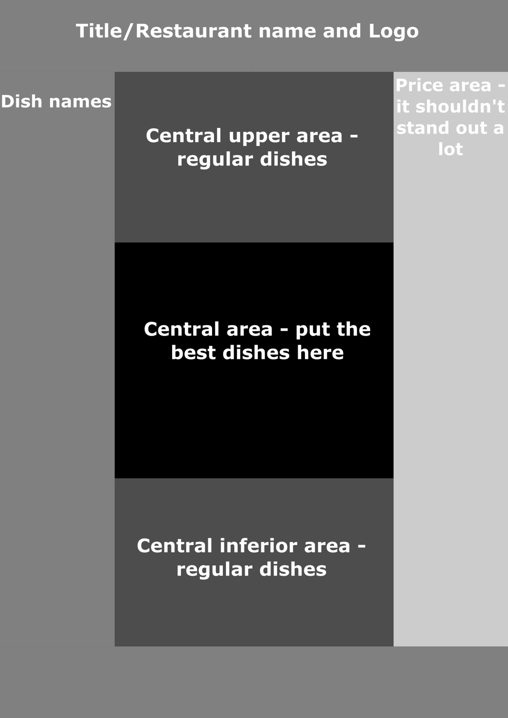
One-page menus are widely used in small businesses.
The most important areas of this type of menu are highlighted in the following example:
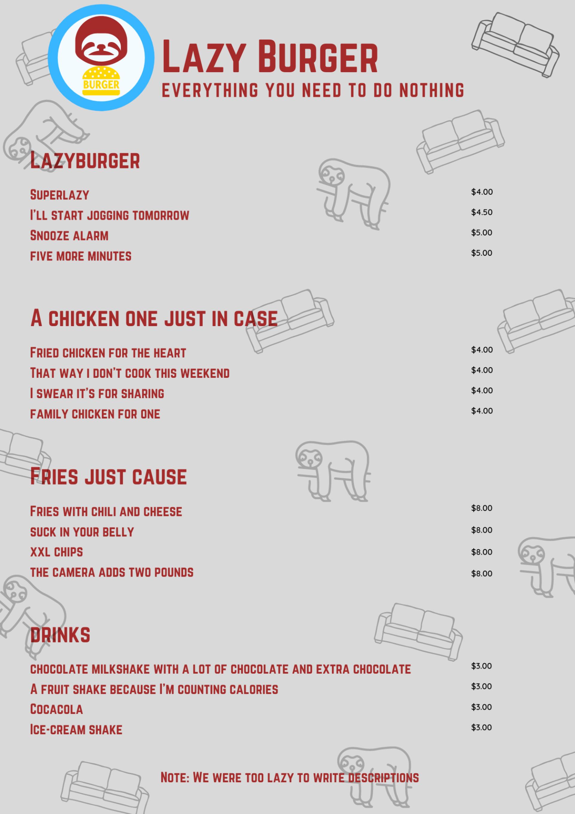
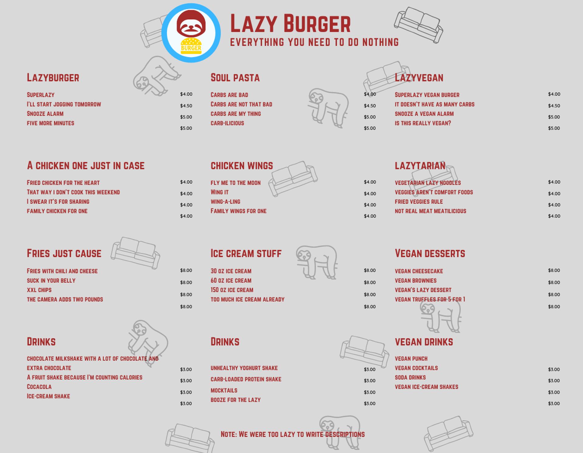
I have created this example using Canva. It is for a fast-food restaurant called “Lazy Burger”.
As you can see, the name of the restaurant, the design, and the names of the menu items make it easy to know what this restaurant is about.
Note: Keep in mind that this is a very exaggerated example!
Folded Menu Template
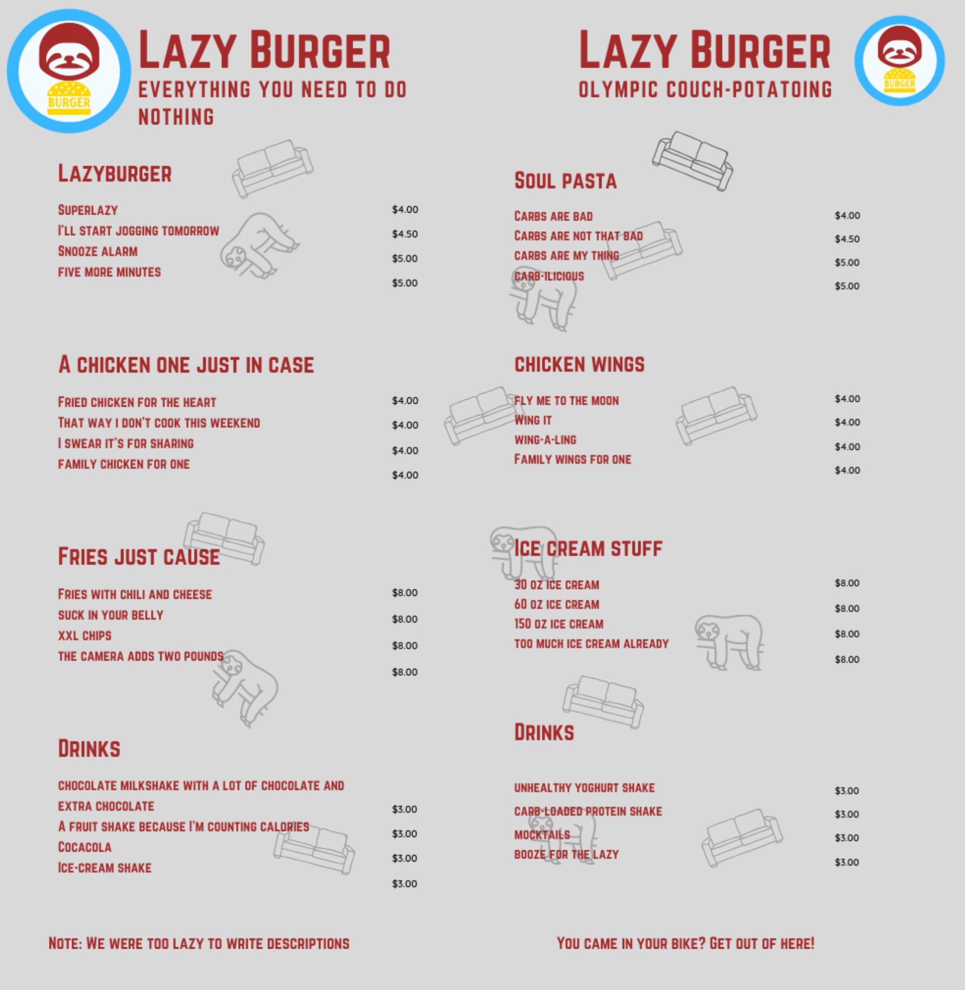
This menu template is simpler and uses the same layout and scanning as the menu above.
In addition, this type of menu has more space, so you can add more dishes from your restaurant to make the most of it.
As you can see, the menu has a noticeable space in the middle, and this is because it is a menu that is folded in half, resulting in a slimmer menu.
You can also take advantage of the outer side to add branding details or even more dishes!
Trifold Menu Template
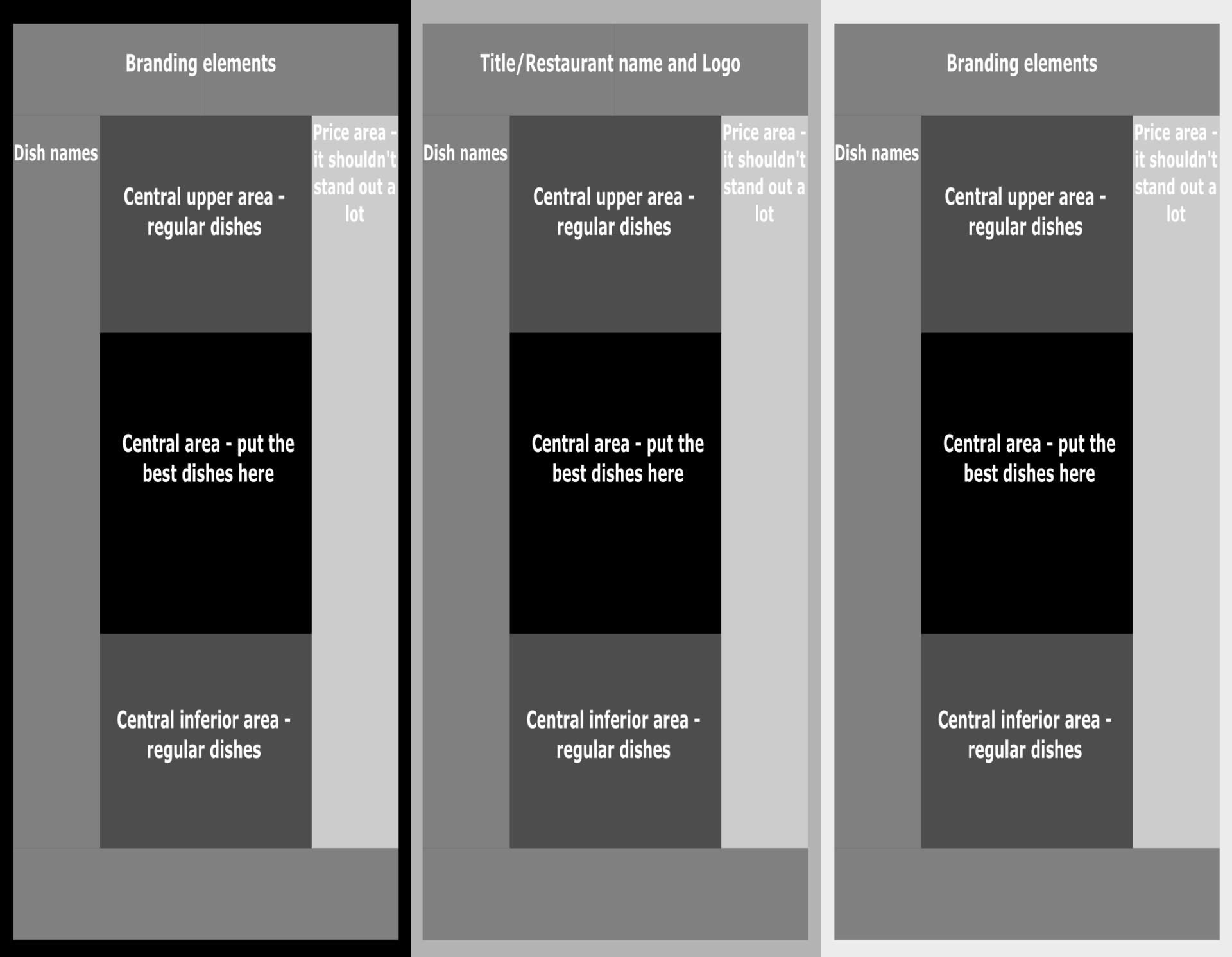
The tri-fold menu template is a very interesting and spacious design.
The way diners scan tri-fold menus is more complex, as it is a three-section menu.
Still, each section of this menu is separated into different categories of dishes, so the menu scan looks a lot like that of an individual page.
Other considerations when designing your menu
I recommend that you read our other articles on menu design and other related topics so you know what to put on your menu and more:
- Restaurant menu types
- How to make a menu for your restaurant
- Menu engineering
- How to create a healthy menu for children
- How to calculate the cost of food
- Profit margin in restaurants
All these resources will help you make decisions regarding the design of your menu, which you will place on the menu, and also define the prices and the margin profit of each dish.
This is important as it comes down to menu layout as such — something as simple as using prices 5% higher than your competitor's prices can lower your sales, even for pennies.
Also, feel free to check out more resources from MustHaveMenus.
You’re not confident in your design skills?
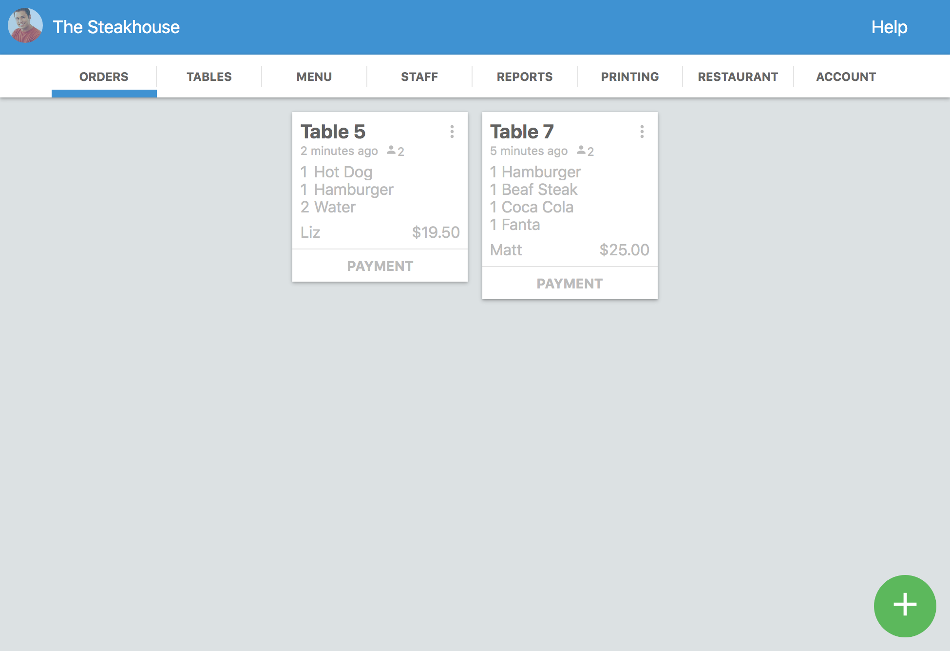
Try out the Waiterio page builder and get access to a simple, elegant, digital menu solution integrated with the rest of the POS system.
Start offering take-out or online orders, delivery, and more. Learn more about the Waiterio page builder here.
Is your menu ready?
